If you follow Taiwan’s indie music scene, you’re probably familiar with Xiao Qing-yang’s (蕭青陽) work, even if you don’t recognize his name. Over the past 26 years, the prolific designer has created nearly 1,000 album covers. On Sunday Xiao will find out if he wins a Grammy Award for the packaging of Story Island (故事島), an instrumental album by composer Lee Cin-cin (李欣芸).
This is the fourth time Xiao has been nominated for the Best Recording Package award. But Xiao was still effusive during an interview at his New Taipei City studio last month as he talked about his upcoming trip to the US, the continuing relevance of CD packaging in an era of music downloads, and the concept behind Story Island.
Xiao is known for creating simple but graphically striking covers, like Wang Yan-meng’s (王雁盟) The Wandering Accordion (飄浮手風琴) (for which Xiao received his first Grammy nomination) and Matzka’s (瑪斯卡) latest self-titled release.

Photo courtesy of Xiao Qing-yang and Shout Visual Studio
But Story Island’s package takes a uniquely tactile and visually low-key approach. Xiao began conceptualizing the artwork, which took two years to complete, before it was attached to Lee’s album. The CD’s cover and 11 separate images packaged within are made from white, laser-cut paper; you have to take the insert out and flip through it page by page to to see the designs.
Insect-eaten leaves that Xiao collected from a park near his home inspired the cover’s lace-like pattern. Upon closer inspection, each “bite mark” reveals itself as a country. Xiao rearranged the world map in seemingly random order, with only Taiwan standing apart to the left.
Some of the other images are dark and unsettling, while others are idealistic. Delicate plumes of smoke envelop a human skull and animal skeletons in one, while another is based on a photo of villagers fleeing from their homes during Typhoon Morakot. Another features a close-up of Amis Aboriginal singer Difang’s (郭英男) hands carefully wrapping betel nuts. Xiao’s inspiration came from life in Taiwan, but he says his artwork’s message is universal: Each person is a steward of the planet.

Photo courtesy of Xiao Qing-yang and Shout Visual Studio
Taipei Times: Consumers have changed the way they shop for music since you began your career. Now that many people download tracks, what role does packaging play in marketing an album?
Xiao Qing-yang: I think that having an eye-catching cover has gotten more important since 2000, when music marketing began to enter the Internet era. The last time I visited New York City, LA and San Francisco, a lot of the brick-and-mortar CD stores had already closed down. I wanted to go to the Virgin Records Megastore while I was in New York, but when I got there, I was so disappointed. There was only a neon sign left. But it was only a few years ago [in 2005] that my work was first noticed by the Grammy Awards. That was a reminder that even though everyone is now downloading their music, people still pay attention to packaging.
TT: Story Island is different from most CDs because the design is low profile. You have to open the packaging and take out the insert to see the laser cut images. Why did you go with this concept?
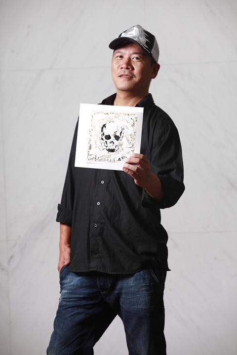
Photo courtesy of Xiao Qing-yang and Shout Visual Studio
XQY: I earned my third Grammy nomination for Poems and Songs (詩.歌) [by Wu Sheng (吳晟)]. The packaging for that was made from wood. The reason I like using unusual materials is because I want people to understand that when you listen to a record, the experience is not just for your ears, but also for your eyes, your hands and all the rest of your senses.
If Story Island was meant to be marketed mainly for online downloads, then there wouldn’t be any point to packaging it like this. But when I see an album with really lovely packaging, I think it gives it value, because you get to take it home, open it, feel the paper and engage with the concept. It helps you understand the ideas behind Story Island.
TT: So you believe that an album’s packaging allows listeners to interact differently with the music?

Photo courtesy of Xiao Qing-yang and Shout Visual Studio
XQY: Yes. I also want them to start returning to brick-and-mortar music stores. When they listen to a CD, I want them to flip through the packaging. The music is just one part of a piece of art. On every record you have a team of people working together who are very talented, including designers, singers and writers. I want to promote the value of design.
There are also a lot of messages in Story Island about the importance of protecting the Earth, the impact each person’s actions have on the rest of the world. When you talk about an album, its value shouldn’t come from having a celebrity behind it. It’s not as simple as that. There should be other things, bigger concepts, in music.
TT: One of the designs that has received a lot of attention in Story Island is the image of the Presidential Office made up of different symbols, with bees and characters from old video games flying above it. What was the inspiration behind that?
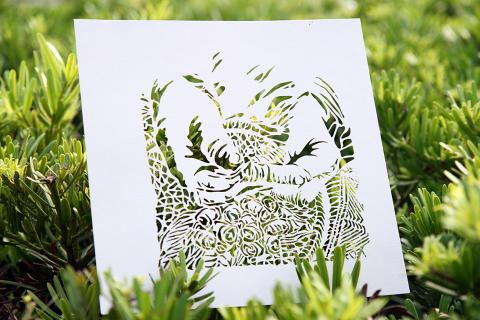
Photo courtesy of Xiao Qing-yang and Shout Visual Studio
XQY: I wanted to choose a building that represents politics, so I went with the Presidential Office because it symbolizes Taiwan’s government for Taiwanese people, like the White House for Americans. The Presidential Office is also very loaded with history and meaning for Taiwanese. During the Japanese colonial period, it was the headquarters for government officials. Then it was used by the KMT [Chinese Nationalist Party] and then Taiwan began having democratic elections. A lot of different politicians have worked there.
But then I thought, what does the White House really symbolize? What does the Presidential Office symbolize? I tried to see them through the eyes of a child. A government is supposed to protect people and keep wars from happening. So I switched the flag above the Presidential Office with a flag like you’d see in a children’s park. I wanted the image to connote happiness and fun, so I used children’s video game characters. There’s a battle going on in the sky, but it’s playful. My design team and I also chose more than 10 patterns from different Aboriginal groups and used them on the Presidential Office. The fireworks in the sky are actually motifs from traditional embroidery by Pingpu groups (平埔族).
I’m really happy with it. I met with President Ma (Ying-jeou, 馬英九) and he said it was great that I used this design to express what my ideal government would be like. And I told him the image’s message is that people hope they can ask their government to build a happy, peaceful nation. I tried to use a cute and cheerful style for this piece, but I am satirizing politics, too. When I started designing it, I was afraid people would think I was being cynical, but it has received good reactions.
TT: What is the process of designing packaging for a CD? How do you collaborate with the record company’s marketing department and the musicians?
XQY: The process for Story Island was completely different from other albums. Before I even talked to Lee Cin-cin about her album, I had already come up with the concept of doing a CD package that used laser cutting and lace-like designs. After four months of working on the art, Wind Music (風潮音樂) contacted me, told me that they were producing Story Island and asked me if I wanted to be involved.
So Lee and I worked independently, but with the same idea. I wanted the packaging to be a piece of art and she felt the same way about her album. Wind Music didn’t try to influence me or get me to alter my design in any way. After both of us were done, we put the packaging and the music together and created the final work.
The usual process is completely different. Sometimes clients need a design really fast, and I will only have a week to finish it. They’ll have the photos of the singer that they want to use and the information they want on the cover and I have to combine all those things.
TT: What are the elements of a good album cover?
XQY: I think a good cover reflects the universe that the music is trying to create. A successful CD package makes people want to treat it like a treasure, as opposed to something they can just toss aside. When they finish uploading the music to their iPod, they shouldn’t look at the package and think, “I don’t need that anymore.”
TT: How did you first become interested in art
and design?
XQY: When I was growing up, my family ran a bakery. I’m really thankful we had that store. I had to work in it; it was tiny and we didn’t make a lot of money, but I would take paper bread bags and draw on them. I got to work on my art every day as I was growing up.
After I graduated from high school, I started working in design. Back then it was really hard. When I started out, I would get just one cover a year. Now my personal record for the most album covers designed in one month is 46.
TT: What music are you listening to right now?
XQY: The last time I was in LA, I found a bunch of stores that sell albums by American Indian bands like Brule. My very first record cover was for Malas Kao (高勝美), a Bunun Aboriginal singer. I’ve worked with a lot of Taiwanese Aboriginal singers, including Pau-dull (also known as Chen Jian-nian, 陳建年) and Difang. I think this is one of the reasons I like American Indian groups, as well as their album cover designs.
TT: Aside from your own work, what CD covers do you like the best?
XQY: I love looking at American hip-hop album cover designs because hip-hop is a relatively new genre and the artists pay a lot of attention to creating an image. I think Eminem’s Relapse is amazing. It has hundreds of pills arranged to create his portrait. And the cover of TI’s The Paper Trail uses strips of papers to make his portrait. I think both are really cool. Over the past decade, American hip-hop records have been the ones with the best covers. The artists present themselves as larger-than-life and each one has a different point of view. I love seeing how they combine artistry and commercial appeal.
TT: When you were younger, what CD covers influenced you the most?
XQY: I really liked Pink Floyd’s album covers. When I was in elementary school, I had no idea who Pink Floyd was, but I thought, “Wow, all their albums have great designs.” It wasn’t until after I grew up that I realized they are a very famous group. When I go to the US, I go crazy shopping at all the CD stores I can find. If I find a CD cover that is designed well, I buy it. When I was a kid, I even sneaked money from our bakery to go buy albums. I was obsessed.
For more information about Story Island’s package design, visit www.storyisland-qing-yang-xiao.com.

A vaccine to fight dementia? It turns out there may already be one — shots that prevent painful shingles also appear to protect aging brains. A new study found shingles vaccination cut older adults’ risk of developing dementia over the next seven years by 20 percent. The research, published Wednesday in the journal Nature, is part of growing understanding about how many factors influence brain health as we age — and what we can do about it. “It’s a very robust finding,” said lead researcher Pascal Geldsetzer of Stanford University. And “women seem to benefit more,” important as they’re at higher risk of

March 31 to April 6 On May 13, 1950, National Taiwan University Hospital otolaryngologist Su You-peng (蘇友鵬) was summoned to the director’s office. He thought someone had complained about him practicing the violin at night, but when he entered the room, he knew something was terribly wrong. He saw several burly men who appeared to be government secret agents, and three other resident doctors: internist Hsu Chiang (許強), dermatologist Hu Pao-chen (胡寶珍) and ophthalmologist Hu Hsin-lin (胡鑫麟). They were handcuffed, herded onto two jeeps and taken to the Secrecy Bureau (保密局) for questioning. Su was still in his doctor’s robes at

Last week the Democratic Progressive Party (DPP) said that the budget cuts voted for by the China-aligned parties in the legislature, are intended to force the DPP to hike electricity rates. The public would then blame it for the rate hike. It’s fairly clear that the first part of that is correct. Slashing the budget of state-run Taiwan Power Co (Taipower, 台電) is a move intended to cause discontent with the DPP when electricity rates go up. Taipower’s debt, NT$422.9 billion (US$12.78 billion), is one of the numerous permanent crises created by the nation’s construction-industrial state and the developmentalist mentality it

Experts say that the devastating earthquake in Myanmar on Friday was likely the strongest to hit the country in decades, with disaster modeling suggesting thousands could be dead. Automatic assessments from the US Geological Survey (USGS) said the shallow 7.7-magnitude quake northwest of the central Myanmar city of Sagaing triggered a red alert for shaking-related fatalities and economic losses. “High casualties and extensive damage are probable and the disaster is likely widespread,” it said, locating the epicentre near the central Myanmar city of Mandalay, home to more than a million people. Myanmar’s ruling junta said on Saturday morning that the number killed had